The eyes know color more than the mind can conceive. By nature we are drawn to color in all of its diversity, from hue to intensity. As artists color is relied upon to translate expression. A painter uses a mixture of pigments to describe forms of visual poetry. Munsell Mix tubes colors of brilliance, mixed with precision, for the artist to paint their next masterpiece.
Question is what color do you need?
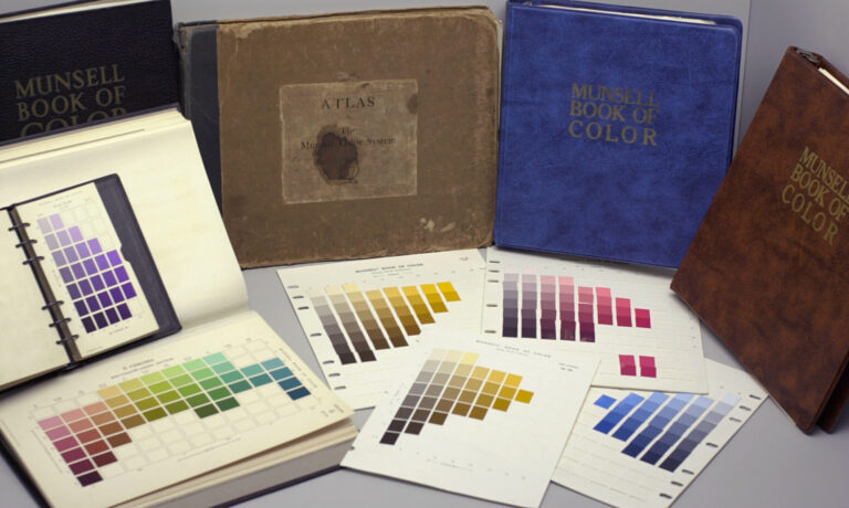
Munsell Mix is an exclusive product specifically hand mixed for oil paint artists, matching each tube of oil paint to a spectrophotometrically accurate color plate provided by the Munsell Book of Color.
Munsell Book of Color - Photo provided by Wikipedia
Color is one of the most fundamental areas of painting.
The process of painting begins with laying down fresh dabs of paint on the palette and mixing to match the color that defines a subject as accurately as possible. Finding the perfect colors of pigment to lie on the palette can be one of the biggest challenges when painting. Oil paints come in varying degrees of color and what one paint company refers to as ‘Yellow Ochre’ may differ in shade or transparency of the ‘Yellow Ochre’ color from another paint maker.
Accurate color standards account for 1/3 of color accuracy: the other 2/3 includes a light source, which is standard and consistent, such as daylight, and people who have the ability to see color accurately.
Munsell Mix takes control over color by using the Munsell color system to produce tubes of paint, which is an incredible tool that sets Munsell Mix apart from other paint makers. The benefits that come with using the Munsell color system are:
the Munsell system brings reliability, flexibility, and logical simplicity to visual color matching and identification for each tube of paint mixed.
the Munsell system provides a quantitative definition that depends on scientific measurements of color classification and specifications tailored for painting.
the Munsell number notation makes it possible to accommodate custom tubes of paint in different variations of value and chroma available in each of the hue families.
Color seems intuitive, but it's not.
Color involves some of the most complicated things on this Earth: light, the human eye, and brain. When it comes to color, Munsell Mix has more passion than any other paint manufacturer. Using the Munsell color system helps provide consistent tubes of paint efficiently and effectively.
Let’s take a look at how the Munsell color system works.
A color system is a collection of all possible colors arranged so that the relationships among them can be easily recognized. Attempts to describe a color accurately by using a color name can be both amusing and futile. How close to blue is sea green, and is red a color that can be described as warm, or cool?
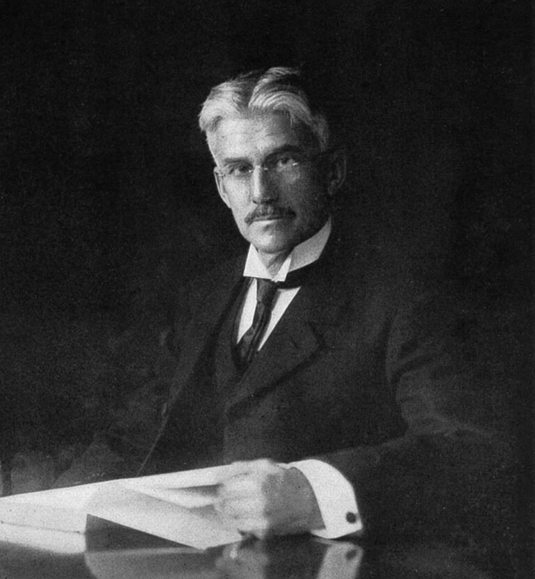
In 1905, Albert H. Munsell, an American painter and teacher, understood the importance of being able to communicate clearly about color. He devoted his life to studying color theory and developed a systematic way of ordering and describing color that has proven accurate and flexible enough to endure from 1915 when The Atlas Of The Munsell Color System was first published.
Color theory is a body of principles, which provide guidance on the relationship between colors and the physiological impacts of certain color combinations. General principles of color theory were evident in writings of Leone Battista Alberti (c. 1435) and notebooks of Leonardo da Vinci (c. 1490). Sir Isaac Newton developed the first color wheel around the start of the 17th century.
Albert Munsell - Photo provided by Wikipedia
Munsell organizes color the way the human eye sees it.
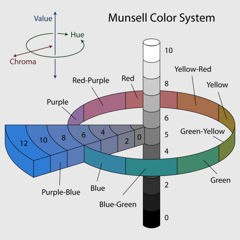
The Munsell color system is a color identification and notation system, which identifies colors by alphanumeric rather than by name. The Munsell system is not only a ruler for color, but also a language with emphasis on what color is and how human beings perceive it. The Munsell system classifies color by three perceptual attributes basic to painting.
Hue, Value, and Chroma
Hue, value and chroma are the three attributes that represent color family, lightness and darkness, and color strength/intensity or saturation/de-saturation. It is the translation between color and value, which is extremely difficult to learn in painting. Every color sensation unites these three qualities, the three dimensions of color.
1st dimension: Hue – the attribute that distinguishes one color family from another; the dominant wavelength of a color. *Hue has one aspect, while color has three.
2nd dimension: Value – how light/dark a color is. Tint to a painter indicates a color mixed with light such as white or yellow, shade indicates a color mixed with dark like black.
3rd dimension: Chroma – the quality that gradates the intensity strength of a color from a weak or dull one. It’s the amount of variation in steps of a color going from a gray tone to chromatic in a fixed degree of value.
A separate scale of numbers can describe each dimension. It is a valuable skill to be able to analyze a color one dimension at a time – first recognizing its hue then how light or dark it is (value), and next how strong or intense it is (chroma).
Munsell Color System - Photo provided by Wikipedia
The typical color wheel consists of 12 colors or hues separated into three sections:
Primary:
Secondary:
Tertiary:
Red, Blue, Yellow
Green, Orange, Violet
Yellow-Orange, Red-Orange, Red-Violet, Blue-Violet, Blue-Green, Yellow Green
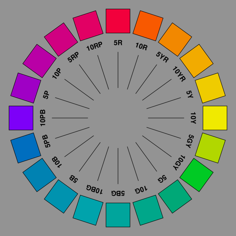
Unlike the standard color wheel consisting of 12 colors, the Munsell system specifies 40 hues. These 40 hues are equally spaced perceptually with discrete stopping points on a continuous hue circle or color wheel.
Munsell chose 10 hues as a basis for the color system, making it possible to divide into decimals, which designate color with more precision. There are five major hues and 5 minor hues, one placed halfway between each major.
R = Red (major) YR = Yellow Red (minor) Y = Yellow (major) GY = Green Yellow (minor) G = Green (major) BG = Blue Green (minor) B = Blue (major) PB = Purple Blue (minor) P = Purple (major) RP = Red Purple (minor)
The scales are then broke down by decimal into four equally measured sections within each of the 10 hues.
2.5R
2.5YR
2.5Y
2.5GY
2.5G
2.5BG
2.5B
2.5PB
2.5P
2.5RP
5R
5YR
5Y
5GY
5G
5BG
5B
5PB
5P
5RP
7.5R
7.5YR
7.5Y
7.5GY
7.5G
7.5BG
7.5B
7.5PB
7.5P
7.5RP
10R
10YR
10Y
10GY
10G
10BG
10B
10PB
10P
10RP
Munsell Color Wheel - Photo provided by Wikipedia
Munsell notation is written as a whole number followed by a letter, which indicates the hue family, followed by a fraction with the numerator representing the value scale and the denominator representing the scale for chroma.
Hue and value scales have a definite beginning and end while chroma can be extended indefinitely. The # of chroma steps possible depends mainly on the specific hue involved, as well as the medium in which it is being produced.
It's in the use of alphanumeric in naming colors that allows the possibility to account for small variations.
While most color theories refer to only three primary colors being Red, Blue, and Yellow, it’s important to understand in paint there are two types of these primary colors: a “cool” set and “warm” set. The Munsell color system simplifies this difference with its alphanumeric placement upon the Munsell color wheel.
Red can identify as 2.5R 3/10, 5R 5/18, 7.5R 4/14, or more. Separately, the alphanumeric may seem complex and requiring memorization to identify the color of paint needed.
When we see the colors in relation to each other, the clarity needs no explanation. Our eyes can see that a 2.5 red leans more cool in relation to the 7.5 red. We can see the subtle shift in value, as well as the difference of intensity as a color has more chroma than the next.
Munsell designed his color scales specific to the way our human eye sees color: in the relationship to the other colors surrounding it. Each of these colors begins to form a cohesive string of subtle variation in hue family, value, and chroma. For example:
A 2.5 R string changing value, with a fixed chroma of /10
Visually, it becomes obvious that this color is varying from dark to light, while maintaining a fixed chromatic intensity of /10, despite the value change from 3/ to 8/.
A 5 R string changing chroma, with a fixed value of 5/
It also becomes clear that when a color gradates from gray tones to being saturated with chroma, it is still very much a part of a specific hue family and value, to the degree.
White, Black, and Gray are not considered hues in the Munsell system. An N for neutral is used to designate them.
A Neutral string of values 1-9
N 1
N 2
N 3
N 4
N 5
N 6
N 7
N 8
Blurred eyes show the difference in transition of color and value between these three strings, revealing some profound insight that has been taught by master painters for centuries in painting form and dimension.
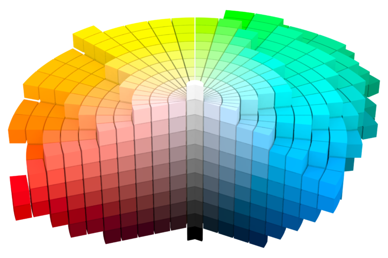
The Munsell color system, based on its three dimensional model, is easily demonstrated on a color solid.
A color solid shows the arrangement of all colors in a three dimensional, spherical geometric form. The center pole represents the neutral scale with white at the top and black at the bottom. The Munsell color solid doesn’t take the shape of a perfect sphere because not all hue families contain the same number of colors.
Munsell Color Solid - Photo provided by Wikipedia
People see more when they know what to look for. Albert Munsell understood the necessity of be able to communicate color with accuracy in a way natural to how we see. For this reason, Munsell Mix proudly mixes each string of paint values and chromas, matched according to the Munsell Book of Color, custom made in tubes for artists to indulge in.
The Munsell Book of Color contains approx. 1300 colors possible for mixing and matching to paint. Using some of the finest oil pigments, Munsell Mix is happy to meet any of your oil paint mixing needs, according to Munsell scale.
Understanding color is a tool for creative expression.
While most people observe hues, they are unaware of the power displayed by strong visual patterns created by values. Value sets the structure of the painting. Value does all the work and hue gets all the credit.
Working successfully with color requires both emotion and knowledge in equal proportion of importance. Hue carries the emotional content of color, value carries the informational content, and chroma is the attention getting quality. Intense color will always catch the eye immediately.
Grackle Studio is on a vacation starting today July 12th until June 31st 2024. We will be back next year. All orders placed before July 12th, 5pm CT will be shipped the following week. You can dismiss this notice to keep browsing through the site. Thank you very much ! Dismiss


One comment
Comments are closed.